The Canvas
The visual editor where you compose blocks into workflows.
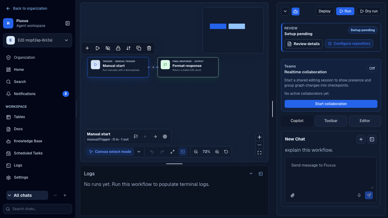
The canvas is where you add blocks, connect them, and configure each step of a workflow. The editor has three side panels — Copilot, Toolbar, and Editor — and a resizable logs terminal at the bottom.
Adding and connecting blocks
Add blocks in three ways:
- Drag from the Toolbar. The Toolbar panel lists the block catalog grouped into a Triggers section and a Blocks section. Drag a block onto the canvas to drop it at that position.
- Quick-add after a node. Every non-output node has a "+" button that opens a searchable, category-grouped menu; picking a block inserts it after that node.
- Ask the Copilot. Describe the change and let the Workflow Copilot propose the graph edit.
Connect blocks by dragging from a node's source handle to another node's target handle. Triggers have no input handle; output nodes have no output handle. Connections are validated live — an invalid wire is rejected with a short on-canvas explanation.
Blocks are grouped into these catalog categories: Triggers, AI, Logic, Data, Knowledge, Integrations, Communication, Developer Tools. See the Block Reference for the full list.
Configuring a node
Double-click a node to open its configuration in the inspector (single-click selects). Each block kind exposes typed fields — for example a schedule trigger's cron and timezone, an HTTP request's method and URL, or a Wait block's mode and duration. Fields can reference upstream outputs using expressions, so a step can consume what earlier steps produced.
Expressions and variables
Expression fields evaluate against the latest run data for the workflow. When a field is focused, Confluye previews the evaluated value server-side, using sanitized run context and returning sanitized display output. Transport errors, syntax errors, and expression evaluation errors are shown as distinct states; while a request is in flight the previous value remains visible and is marked stale when appropriate.
Autocomplete suggestions are built from the workflow and the reconstructed run context. Common
variables include input, lastOutput, $json, $itemIndex, $now, and $node. The Variables
panel mirrors those values from the active run so you can insert the exact expression you need
without typing a long path by hand.
Expression preview requests are rate-limited, size-capped, and timed out on the server. If the workflow has not run yet, the field still shows autocomplete suggestions but no evaluated preview.
Mapping data into parameters
The Input panel supports search for upstream fields. Drag a field into an expression-capable parameter to insert the matching expression at the cursor; click-to-insert is available as a keyboard-friendly equivalent. Non-expressable fields reject expression drops instead of silently changing the value.
Navigation and layout
The canvas is a pannable, zoomable graph with two interaction modes — select and move.
- Pan/zoom: scroll to pan; zoom controls show a live percentage, with fit-view and reset-view.
- Selection: click to select a node or edge; drag-select in select mode.
- Snap-to-grid: off, small, or large grid.
- MiniMap and controls aid navigation on large graphs.
- Navigator: jump to the first trigger, upstream, downstream, or output node.
Readable graphs and connections
New graphs created through MCP, Command Center, or Workflow Copilot are spaced automatically when blocks are crowded or excessively far apart. Layout reserves room for card content and router ports, keeps the main path together, and leaves sticky notes in place. To reorganize an existing workflow, choose More options → Auto layout, then Fit to view. This saves a draft change; it does not deploy the workflow. Undo can restore the previous arrangement.
Ordinary connections are muted. Select a block or connection to highlight the relevant wires and fade unrelated connections. Routes labeled error, On Error, failure, or failed stay red, including their labels and arrows. Red identifies an error branch, not proof that it ran. Hover over a connection to see its source, destination, and route in a tooltip. Port tooltips explain inputs and outputs; an output with run data shows the existing last-run preview. Fit to view can zoom out to 8% for an overview of large graphs; zoom in again to read individual blocks. Long forward error connections use an exterior lane to avoid crossing the main cards.
When you drag a block, the whole card rises and swings from its top edge, tilting and flexing in response to how quickly you move it. Changing direction reverses the swing; slowing down or releasing the card lets it spring back upright while its shadow fades. Groups of selected blocks swing more gently together. Attached wires flex like ropes. This visual motion does not resize the graph layout. Your system's Reduce motion setting disables the card's movement, rope animation and moving dashes; a static shadow still identifies the moving card. Changing this setting during a drag takes effect immediately.
Undo and redo are available, and most actions have keyboard shortcuts (zoom, fit, duplicate, delete, run selection, and arrow-key navigation between connected nodes).
Copy and paste
Use Cmd/Ctrl+C to copy the selected workflow blocks and Cmd/Ctrl+V to paste them back onto the canvas. Paste creates new ids, appends "copy" to each pasted label, offsets each paste by 24 px, selects the pasted blocks, and recreates only the copied edges whose source and target were both included and still form a valid connection.
Trigger and Output blocks stay unique and are not copied. Clipboard shortcuts are ignored while focus is inside an editable field, so normal text copy/paste keeps working in parameter inputs.
Collaboration
The canvas supports real-time multiplayer editing: collaborators' live cursors render directly on the graph, so multiple people can work on a workflow together.